Technically, I haven’t lived in Laurel for about 15 years. But being just around the Beltway in Northern Virginia, I do enjoy coming back for frequent visits; and for photographs and research for Lost Laurel. Maintaining that close proximity to my old hometown is particularly important to me when things happen—like when buildings are torn down, or when malls are closing their doors.
While I enjoy a west coast vacation as much as the next guy, I was sad to learn that the old Laurel Shopping Center Cinema sign was quickly (and apparently without much advanced notice) dismantled last week while I was in Los Angeles. Had I known, I would’ve hopped onto said Beltway in a heartbeat to get as many photos of the process as possible. Fortunately, there were some like-minded readers who happened to be nearby, who did just that—a big thanks to those who posted them and tipped me off to the impending changes!
There were also a few surprises to be found as the old sign was pulled apart… but more on that in a moment. First, let’s take a look at a few photos I’ve found of the sign from the past decade or so—a decade which saw a rapid deterioration of one of the most prominent signs along the Route 1 corridor.

Photo: Kingkongphoto & http://www.celebrity-photos.com (Flickr)
The above photo brings back vivid memories of dusk at Laurel Shopping Center, despite the unusual selection of films. These are the same neon hues that I recall when The Breakfast Club was highlighting the marquee in 1985. But by March 2010—and after at least one period of closure—the Cinema had reopened with an apparent emphasis on Bollywood films.

Photo: Kingkongphoto & http://www.celebrity-photos.com (Flickr)
Admittedly, I haven’t seen a film in that theater since 1995’s Braveheart, when the sign was already showing its age badly. Over the next few years, the neon lights that comprised the word “CINEMA” gradually blew out and/or broke, and weren’t replaced. Equally visually-crippling, sometime after Laurel Centre officially rebranded itself as “Laurel Mall” in April 1998, the sign lost its oval Laurel Centre logo which co-branded it with Laurel Shopping Center. The result was a blank white, functionless oval that projected off the sign like a tumor.
And when the Cinema finally closed again, the sign sat unused at all, simply gathering rust. I’d actually been wondering if there were going to be any plans to tear it down… before it eventually fell down on its own.
Fast-forward to just a couple of weeks ago, when a whimsical message appeared on the old marquee:
Sure enough, within days—and despite the vicious DC heatwave I managed to avoid while in LA—friends were posting photos on Facebook of the sign coming down. And it was in this first one, by Joe Leizear, that something caught my eye:
Do you see it, too? Red lettering.
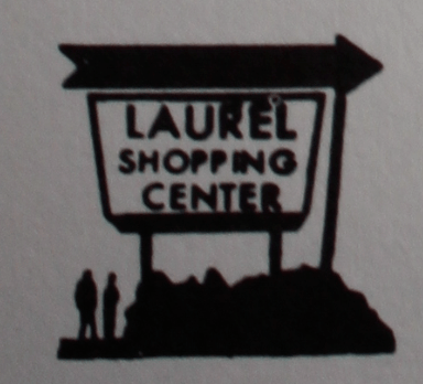
The word “LAUREL”in large, red block letters—not something that I had ever seen on the Cinema sign. In fact, it had been hidden beneath the Cinema marquee all along. I realized that the Cinema sign had merely covered the original Laurel Shopping Center sign, which I never had the chance to see before in person. In fact, it was only while recently digging through old directories that I came across a logo representation of it—this one from 1976:
Subsequent photos, such as the one below, showed the additional elements of the original sign, including the end of the arrow—which had been obscured all this time by the clumsy “Laurel Shopping Center” top band and aforementioned oval protrusion which covered/replaced the arrowhead:
Facebook user Spleenless Jen shared some fantastic images of what was left of the original panels before they were dismantled, shedding even more light on the faded red typography that had been hidden for over three decades:
That brings us to the new sign.
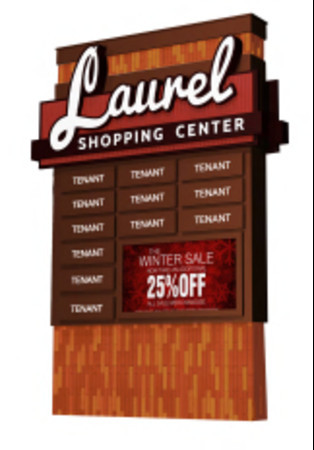
I’ve seen a few photos floating around, including an early artist’s rendering (the signature type of which has been modified in the final product, apparently).
What to make of this more modernized and functional signage, which includes a digital screen and a colorful, decorative motif? Is it an improvement? Over a rusted, misused sign that was likely beyond repair—yes, absolutely. As a promising retail beacon that will draw shoppers for decades to come? Frankly, I’m not that optimistic.
For starters, nothing about the new sign is unique or differentiates it from countless other shopping centers. It’s not necessarily the sign’s fault, mind you—it takes more than just a sign to successfully brand a franchise. Unless someone is planning to update the entire shopping center and integrate the new motif—or at least the colors, to some degree—they’re stuck with a new sign that simply doesn’t fit the shopping center it’s intended to represent.
Worse, from a functionality standpoint, I would be deeply concerned about the feasibility of maintaining that video screen. Not to be a downer, but how long before a vandal (pedestrian or motorist) decides to shatter or otherwise deface it? Let’s be honest—Laurel has always had its share of ne’er-do-wells; and such fancy new devices—literally within arm’s reach—might as well include a sign with a bright red target that says “please vandalize me”. And historically, the shopping center and mall both have not exactly been great about maintaining features that require, well, maintenance. Remember the unique revolving carousel platform in the mall’s center court that eventually stopped revolving? And the very sign that we’re now discussing? My point exactly. If and when these types of things break repeatedly, shopping center management is likely to simply stop fixing it. And when it’s literally the face of the shopping center, such as this sign will be—the first thing visitors see upon approaching—that’s not good.
Granted, I’ve never bought a giant neon sign for a shopping center before, nor have I designed one (yet). But as a designer, my priority would always be to ensure that whatever sign I implemented was relevant and suited its environment. I wouldn’t include decorative elements that weren’t reflective of the larger shopping center itself. If the surrounding area was prone to or accessible to vandals, I wouldn’t position expensive components like digital screens close to street/sidewalk level. Moreover, I’d want to know all I could about the shopping center and its origins, and design a complete brand that highlighted its best features and spoke to its historical significance—and have the sign be the linchpin of that brand. Consider a book cover design; it needs to properly represent the story within—and it needs to attract readers. A shopping center sign isn’t much different in that regard.
Laurel Shopping Center opened in 1956, and arguably saw its best days in the 1960s. (I wasn’t born yet, so I can’t attest to that). But by most accounts, the shopping center was profitable and ever-expanding—a growth that continued well into the 70s with the addition of Georgetown Alley. There have been some aesthetic modifications over the years, for better or worse: awnings and storefronts have evolved, most notably. But the core design has remained the same. It’s still fundamentally a 1960s open-air shopping center; something that could’ve been embraced in the design of the new sign rather than mocked. “The 60s called and they want this sign back”. Really? I think the 60s called and expressed their hope that somebody would’ve had the foresight to restore the shopping center’s original sign, rather than replace it with a generic model that most likely won’t survive a third of the time that its predecessor did.
Even that fleeting glimpse of the old sign’s red lettering and bold arrow reveals a timeless typography that could’ve been resurrected and repurposed into a more suitable, modern sign; a melding of past and present that suggests a long-standing shopping center that the community is proud of. The new sign just doesn’t accomplish that.
Our friend John Floyd II supplied the following photos today, showing the base portion of the new sign already in place. Because the top piece had not yet been attached, he was able to point out something interesting: once again, part of the original sign is still being used—those two vertical I-beams. That original sign simply won’t die, it seems. He also astutely noted the issue with the decorative motif—even more bluntly than I had.
“That funky orange-and-brown block design on the sign’s plinth looks like the 1960s got traded in favour of the 1970s! Very disco and Brady Bunch-esque!”
Coincidentally, the Laurel Centre/Mall notoriously replaced all of its original brown floor tile and wooden accents in 1991—less than 12 years after the mall opened—because management felt that it was “too 1970s”. Ironic that a 1970s pattern would now emerge on the brand new sign for Laurel Shopping Center.


